17 Ways To Improve Your Course Sales Page Conversions
Online Courses · 2021-05-05
Here are 17 Fixes to help your course page convert:
1.
The Fix:
Make the Title count
The Why:
Your Title (H1) is the first (and most prominent) element we see right away. That first line of text is the difference between hooking them and losing them.

2.
The Fix:
What’s inside GIFs are your best friend.
The Why:
Instead of talking about what’s inside, show it. Give us action shots.
3.
The Fix:
Be clear, not clever
The Why:
Those great puns you thought about for your headers? They probably won’t convert well. Keep it super simple.
4.
The Fix:
Build-in social proof into your copy
The Why:
Social proof isn’t just logos. Use it to enhance benefits and outcomes.
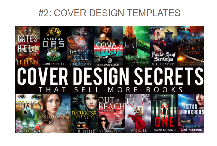
5.
The Fix:
Only use imagery that moves the story along.
The Why:
If your course only needs words to describe it, don’t use imagery “just because.” Imagery should enhance the experience.
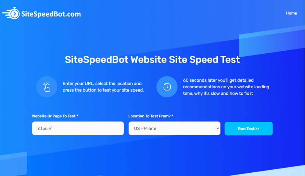
6.
The Fix:
Make the page fast
The Why:
Speed can make or break the user experience. Use Sitespeedbot to find opportunities for your site.
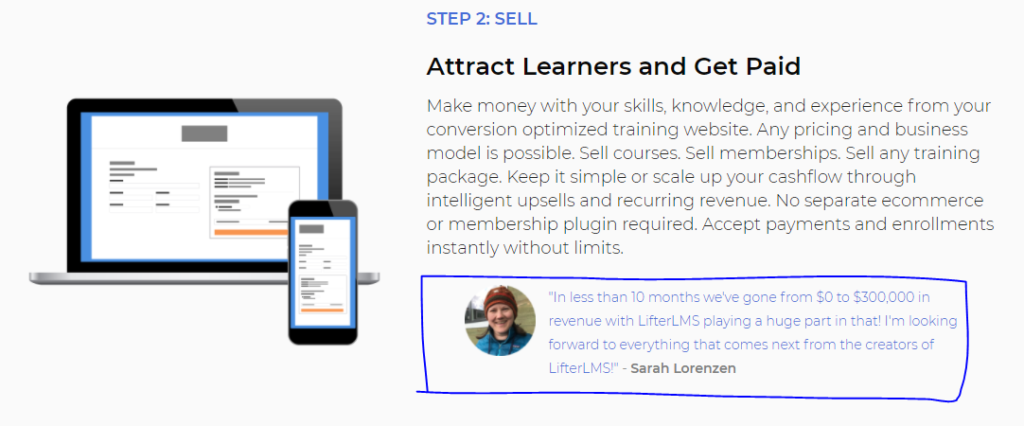
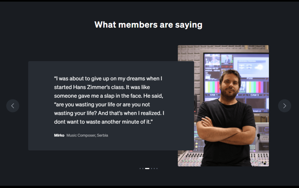
7.
The Fix:
Proof from real people works
The Why:
Testimonials are good. Testimonials with images are great. Video testimonials are next-level. An incredible way to boost buyer confidence.
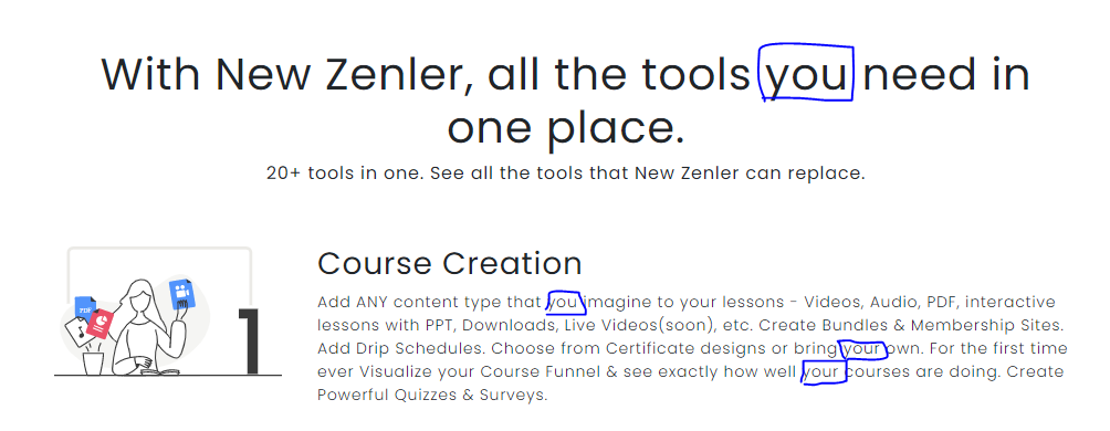
8.
The Fix:
Make it about the user.
The Why:
Don’t talk about the brand. Talk about the user. Make the whole page copy and design cater to them.
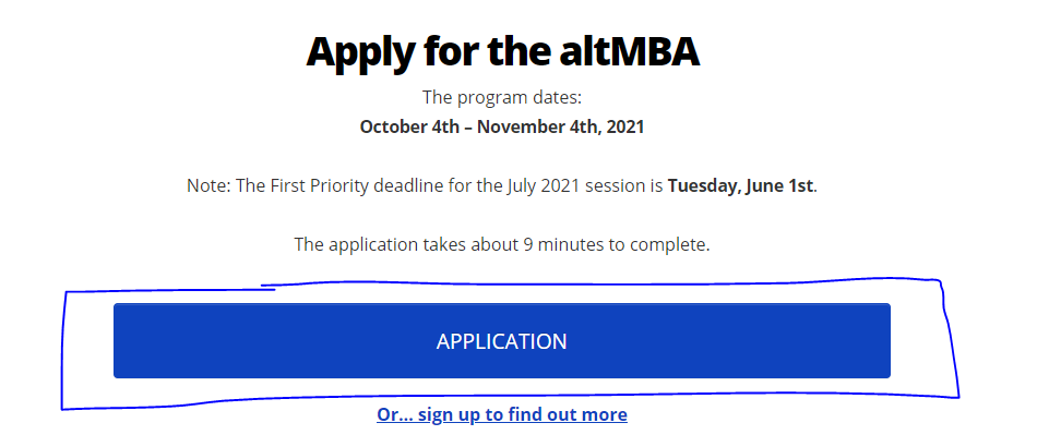
9.
The Fix:
Clear CTA
The Why:
Limit CTAs to the bare minimum. One action for buyers. One action for the undecided.
10.
The Fix:
Make elements interactive
The Why:
Let them choose their own path. Make it feel as if what you’re selling is built especially for them. Interactive elements work wonders.

11.
The Fix:
Keep the home page focused.
The Why:
Your home page is NOT your “everything” page. You shouldn’t have all features, blogs, white papers, etc. on the home page.

12.
The Fix:
Don’t attempt to win over people with fancy designs.
The Why:
Keep it simple. Extra elements distract from the core purpose. Win conversions not awards. Too many moving parts make it hard to focus.

13.
The Fix:
Create an ideal above the fold (ATF.)
The Why:
Menu, H1, Subheader, Button, and a tiny bit of social proof should all fit above the fold.
14.
The Fix:
CTAs should do exactly what they say.
The Why:
Don’t get cute or clever with button copy. Don’t be vague. Tell people exactly what happens when they click it.
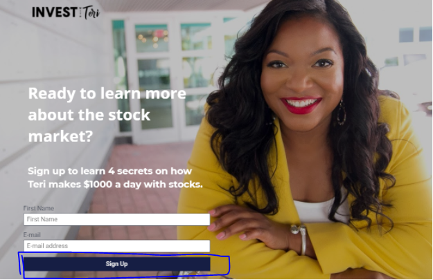
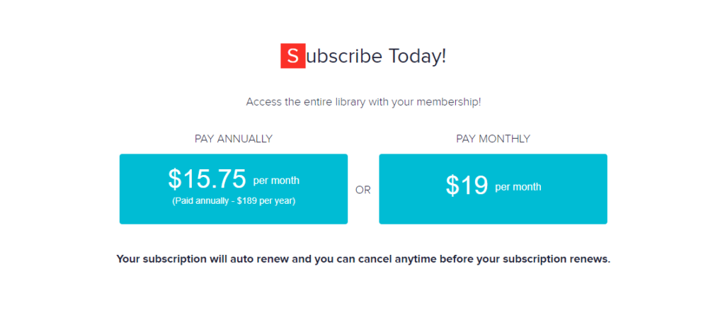
15.
The Fix:
Do not hide pricing.
The Why:
Place it directly on the sales page. Easy to access. Don’t make people waste their time looking for valuable info.
16.
The Fix:
Introduce yourself with a video.
The Why:
People study better if they like the teacher. Give them a quick idea of how you act, speak and put ideas across. When choosing between two courses the more likable teacher wins.

17.
The Fix:
Use clear targeting
The Why:
People should know immediately if the course is for them or is not for them. Trying to speak to everyone convinces no one.
![]()