Best 5 Online Course Sales Page (7-Figure) Examples
Online Courses · 2022-09-16
A reader messaged me and asked whether I can show him some great examples of online course sales pages.
I almost gave him a “google it” answer… but decided to do a quick look-see for myself.
Opened the first few articles and new immediately that I have to write one (thanks teachable’s blog… you were the deciding factor).
Here’s the excerpt that made this decision for me:
“Teachable makes creating your sales page easy, our plug-and-chug editor helps you create a professional page that’s proven to convert no matter your experience level.”
This thing ranks as #1
I can’t imagine that anyone cares what teachable can do or how pretty the site looks (except the other platforms OR folks selling design services).
If you’re searching for best course sales page templates or examples…
There’s only one thing that matters.
Do these pages convert?
Otherwise you’re stealing ideas, sections, elements and concepts for no reason.
The top 10 articles are all written by platforms that no nothing about selling courses but hoping you’ll choose them. It’s like trying to learn painting from the guy that sells a paint brush.
So I upped the stakes
Instead of showing you highly converting examples, I chose only ones that are making 7-figures+
Here we go
Each of the 5 Course Sales Page Examples Below Earns Their Creator 7 figures
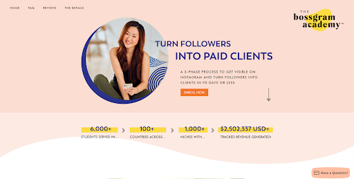
The list is in no particular order:
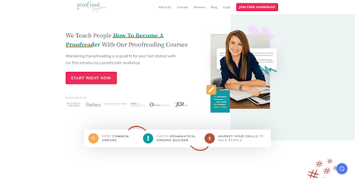
https://proofreadanywhere.com/
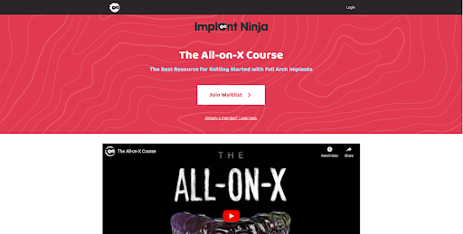
https://school.implantninja.com/p/the-aox-course
https://www.culinarynutrition.com/program/

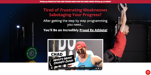
https://wodprep.com/wodprep-academy/
How to Use These Examples to Design Your Course Sales Page
Looking at these pages without a solid foundation and understanding of the sales process won’t help you. You’ll just copy things that look nice to you and not ones that help make sales.
Let’s change that.
Each sale of a course moves the prospect through 4 different stages.
-
Point out a problem they’re currently facing
-
Possibility: How someone, somewhere, at some point has done at before and what it did for them.
-
Potential: That they can do it too. Breakdown the curriculum into a method or process.
-
Proof: That just like you did and said can be done… others have done it too.
-
Give call to action
Now that you know these you can go over each page and look for how it does that.
Once you understand the flow, next you pick the favorite section designs and replace them with your content.
There’s no secret here. The winning formula comes down to having (A) the right sales path & (B) all of the must-have sections in place.
Sections of a Converting Sales Page
The winning formula
- Headline/sub-headline: These two sentences will make or break your course page. Usually lead with a question and describe solution.
- VSL (Video Sales Letter): I prefer these over running a webinar (as you might have to do them live for a few months before you dial one in that converts well.) They do a similar job of gaining trust, are much shorter (3-5 minutes) and easier to test.
- Course description: Some people want to know exactly what they will learn, why they should learn it, in what order & how long it will take. Here is where you go into further detail on how you will take them through your proven process and who it is for.
- Case study/testimonial: Add social proof and testimonials from people just like them that have taken your course and achieved the desired outcome. The more you have & the more these people are “like” the potential buyer, the better they will work.
- Call to action button: The sales page has only ONE purpose. To have the buyer click over to the check out page. Make these stand out and easy to understand. Don’t get clever or confuse people. An example of a CTA might be a large orange button saying “Enroll Today Here”.
- Instructor bio: People want to know why you’re the right person to teach them. If there are other courses on same topic available, you’re the only differentiator.
- Case study/testimonial: In-depth examples of other people just like them going through the process, showing the before and after which can nudge them towards the “buy” button.
- FAQs: Compile the questions you’re getting, or ones you assume people and ask and list them all below. Your goal is to automate the sales process and not spend hours each day answering the same email questions.
- Call to action button: This CTA is the only point of a sales page. They shouldn’t be able to do anything else other than move closer to the purchase or leave.
What to pay close attention to when reviewing each sales page?
Once you understand the flow you’re going to take each student through. Now you want to start looking for ideas, descriptive ways of saying things, design inspiration etc.. that you can steal for your own page.
Here’s a quick breakdown of what to look for (layouts and how they’re written):
- Color schemes
- Headlines
- Course descriptions
- Case studies & testimonials
- Call to actions
- Instructor bios
- FAQs
At least you now know that you’re looking for the right things and copying from the best course creators.